IVN: Exercise 1
2/9/2020 - 16/9/2020 / Week 1 - Week 3
Lim He Yu (0340423)Bachelor of Mass Communication (Advertising) / Illustration & Visual Narratives
Exercise 1/ Vormator Challenge
Lectures
Week 1
Principles of character design:
Week 2
Chiaroscuro refers to the use of light and dark to create the illusion of three-dimensional volume on a flat surface. The term translates to "light-dark"; chiaro meaning bright or clear and scuro meaning dark or obscure.
Week 3
Lectures
Week 1
Principles of character design:
- Triple emphasis on shapes
- Colour
- Emphasis and contrast
- Harmony (shapes, lines, colours, patterns)
- Expressions and poses
Week 2
Chiaroscuro refers to the use of light and dark to create the illusion of three-dimensional volume on a flat surface. The term translates to "light-dark"; chiaro meaning bright or clear and scuro meaning dark or obscure.
Week 3
No class.
Instructions
We were given a set of 8 vormator shapes to create a character to be put on a trading card design. The 8 eight vormator shapes are shown below. With the limited freedom to draw the shapes we want, I am grateful that we get to merge or subtract the shapes.
Idea Exploration
Drafts
Coming up with a character using those eight shapes was kind of a challenge, so I've decided to make several before deciding one character. Before I coloured, merged and subtracted the lines, I wanted to show how these shapes come together to form a character. Shown below are the character drafts that I came up with.
 |
| Figure 1.0: Dancing Bunny |
 |
| Figure 1.1: The Viking |
 |
| Figure 1.2: The Bipolar Princess |
The Character
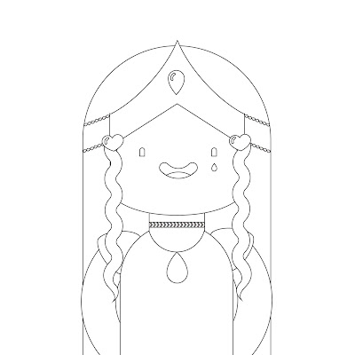
After comparing the drafts, I decided to go with the Bipolar Princess, because the process of putting the shapes together is more complex. Not to mention, the narrative for this character is more interesting. The next step after choosing the character I want to proceed with, I started to merge and subtract the shapes. Then, I proceeded to the colour the character and added a background for her. For the colouring part, I wanted incorporated the use of gradients on her hair. As a final touch, I added a grainy texture to bring the background and character together.
 |
| Figure 2.0: Merged and Subtracted Character |
 |
| Figure 2.1: Final Character Design |
Trading Card Design and Character Narrative
For the trading card design, I wanted to go with something simple, and for it to be something nice to look at. As for the narrative for the character, she's called Bipolar Princess for a reason. One minute she's charming, sweet and alluring; Another minute, the fire behind her back will roar as she turns into your worst nightmare. Fret not though, she's only out to hunt egotistical douchebags who thrive on taking advantage of seemingly weak females. Her only weakness? Nice guys. Shown below is the trading card for this character, along with a mock-up.
 |
| Figure 3.0: Final Trading Card Design |
 |
| Figure 3.1: Trading Card Mockup |
Feedback
Reflection
Experience:
I think this project is somewhat difficult in terms of the limitations of forming a character with merely 8 shapes.
Observation:
Through drafting out ideas, it helps you to explore more ways to make something better.
Findings:
i realized the importance of actually performing the process of drafting and trying to challenge yourself, so you can think out of the box.


Comments
Post a Comment