Typography - Project 2A
29/5/2020 - 12/6/2020 / Week 7 - Week 9
Lim He Yu (0340423)Bachelor of Mass Communication (Advertising) / Typography

Project 2A: Font Design
Lectures
Week 7 (Introduction and Briefing)
This week we were briefed on the first part of Project 2, which is font design. We were tasked to design a new typeface with the letters "a i m e p y t g d o b ! , .", using Adobe Illustrator and Font Lab to generate the typeface. Apart from that, we watched a video about creating typefaces from AIGA, which was really helpful as it explained the basics of designing a typeface. We were told to dissect and analyze a typeface, then draw at least 3 sketches of our font designs before digitizing the work.
Mr.Vinod also explained what we needed to know when it comes to designing a font. For instance, x-height, cap height, baseline and so on. I've included the gist of what he explained below in the form of a picture.
 |
| Figure 1.0: Describing Letterforms |
Week 8 (Feedback Session & Demo)
This week we were given feedback to our font design sketches and digitized work. Other than that, we were given a demonstration on how to generate our designed typefaces using FontLab.
Week 9 (Screen and Print & Progress Check)
This week we continued with progress checks and we were told to finalize our work in the form of a poster with the text "I am a type god, obey me!" in A4 size. Apart from that there was a lecture on screen and print.
Print Type
- type was design reading from print
- designers need to ensure text is smooth, flowing and pleasant to read
- highly readable at small size, versatile, easy-to-digest
- Caslon, Garamond, Baskerville
- optimised and often modified to enhance readability onscreen
- taller x-height
- wider letterforms
- more open counters
- heavier thin strokes and serifs
- reduced stroke contrast
- modified curves and angles
- more open spacing (typefaces intended for smaller sizes)
- non-print mediums- web, e-books, e-readers, mobile devices
Hyperactive Link/Hyperlink
- word, phrase or image you can click on to jump to a new page/document
- usually blue and underlined
- cursor will change to a tiny hand if hovering over hyperlink
Font Size for Screen/Print
- 16-pixel text on a screen is about the same size as printed text in a book/magazine
- If you were to read at arm's length, size should be at least 12 points (print)
Instructions
Project 2a: Font Design
Tasks
Week 7
In the first week of the project, we were told to dissect the typeface of our choice, we had to dissect the letters O, D and H. I've chosen Univers (Roman) because it's a very versatile serif font, and it's easier to work with in terms of design, at least in my opinion.
 |
| Figure 1.1: "O" Dissection |
 |
| Figure 1.2: "D" Dissection |
 |
| Figure 1.3: "H" Dissection |
After that, we were tasked to sketch out our font design ideas, we were advised to do at least three sketches. After doing the sketches, I was advised to proceed the digitization process with the third option. Shown below are my sketches.
 |
| Figure 1.4: Sketches |
WEEK 8
The feedback that I got from Mr.Vinod after showing my digitized work, was to match the "E" crossbar with the one in "A". I was also advised to reduced the bowl size of "P" so the gap above and below matches the other crossbars. Apart from that, I felt that I needed to thicken the tail of the "Y" as well.
 |
| Figure 1.5: Partly Digitized Work |
 |
| Figure 1.6: Final Font Design |
Apart from receiving feedback for the digitized work, we were also shown a demo to generate our designs into a legitimate typeface using FontLab, which was pretty exciting. Due to the fact that FontLab 5 doesn't work on my computer, I had to improvise and use FontLab 7. Shown below is a brief process of using FontLab.
 |
| Figure 1.7: Inserting the glyphs |
 |
| Figure 1.8: Adjusting the glyphs |
 |
| Figure 1.9: Kerning |
 |
| Figure 1.10: Exporting |
 |
| Figure 1.11: Final OTF Ready for Installation |
WEEK 9
After installing the newly generated font, we we're tasked to showcase our font design in the form of an A4 poster, with the given text "I am a type god, obey me!". After showing Mr. Vinod the poster, I was advised to replace my comma placement with an em-dash and change my type name size to 8 points. Shown below is the draft and revised version of the poster.
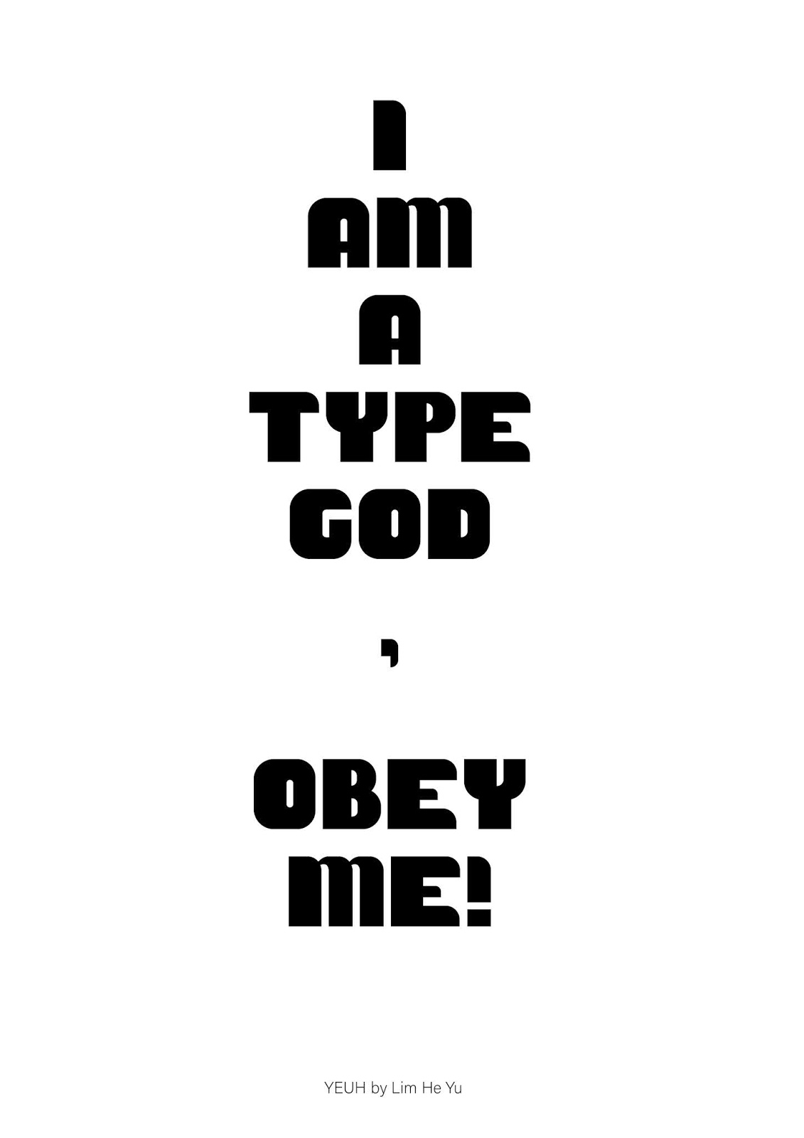 |
| Figure 1.12: First Draft Poster |
 |
| Figure 1.13: Revised Poster |
FINAL OUTCOME
 |
| Figure 1.14: Final Font Design.jpg |
 |
| Figure 1.15: Project 2a Final.jpg |
Feedback
Week 7:
Specific Feedback:
- Proceed to digitize the third sketch
Week 8:
General Feedback:
- Final JPEG must be exported (BW) 300dpi and uplaoded to your eportfolio
- You must embed your Final PDF layout (only final in PDF format)
- You must make your document visible to everyone in Google Drive
- Mention demonstration of briefing occurred during class, if no formal lecture
- Further reading must be accompanied with an image of the book or the site.
Specific Feedback:
- Match the "E" crossbar with the one in "A"
- Reduced the bowl size of "P" so the gap above and below matches the other crossbars.
Week 9:
Specific Feedback:
- Replace comma placement with an em-dash
- Change type name size to 8 points
Reflection
Week 7:
Experience:
This project feels a bit intimidating because I have no idea how to design fonts in the first place, like I have no idea on how to come up with a whole new font design.
Observation:
I am grateful that Mr.Vinod showed the AIGA video on the basics of font design, that video was very helpful, and it encouraged me to try, instead of complain about not knowing how to do something.
Findings:
This week made me realise that I have to actually have the balls to take on a challenge to learn something new, this week has encouraged me to be brave to go through trail and error.
Week 8:
Experience:
The experience of digitizing the font designs and generating it took longer than expected, because the software encountered problems in my laptop. Nonetheless, it was great to see the outcome of your design turn into a legitimate-looking typeface.
Observation:
Even though the design process was long, I had fun doing it. I have to admit, trying to fix the software was infuriating, because you're so close yet so far, and I was really frustrated.
Findings:
Ultimately, I'm glad to have solved the problem by installing FontLab 7. I've learnt that being angry at something doesn't make things better, sometimes you just have to take a step back and think of other alternatives instead of insisting to fix an irreparable problem.
Week 9:
Experience:
I'm excited that this part of the project is almost coming to an end, and I'll have one less thing to worry about. Plus, this final part (poster) is relatively easy compared to the actual font design itself.
Observation:
I wanted to opt for a simple layout to let the font design stand out on its own, and of course, I had to change some minor details.
Findings:
I've learnt to push through hard times, and realise that things will eventually come to an end.
Experience:
The experience of digitizing the font designs and generating it took longer than expected, because the software encountered problems in my laptop. Nonetheless, it was great to see the outcome of your design turn into a legitimate-looking typeface.
Observation:
Even though the design process was long, I had fun doing it. I have to admit, trying to fix the software was infuriating, because you're so close yet so far, and I was really frustrated.
Findings:
Ultimately, I'm glad to have solved the problem by installing FontLab 7. I've learnt that being angry at something doesn't make things better, sometimes you just have to take a step back and think of other alternatives instead of insisting to fix an irreparable problem.
Week 9:
Experience:
I'm excited that this part of the project is almost coming to an end, and I'll have one less thing to worry about. Plus, this final part (poster) is relatively easy compared to the actual font design itself.
Observation:
I wanted to opt for a simple layout to let the font design stand out on its own, and of course, I had to change some minor details.
Findings:
I've learnt to push through hard times, and realise that things will eventually come to an end.
Further Reading
Week 7 - The Anatomy of Type: A Graphic Guide to 100 Typefaces (Stephen Coles)
The Anatomy of Type explores one hundred traditional and modern typefaces in loving detail, with a full spread devoted to each entry. The full character set from each typeface is shown, and the best letters for identification are enlarged and annotated, revealing key features, anatomical details, and the finer, often-overlooked elements of type design. Containing in-depth information on everything from the designer and foundry, the year of release, and the different weights and styles available, The Anatomy of Type is more than a reference guide to the intricacies of typeface design. It is a visual send-up of some of the world’s most beloved typefaces, beautifully displayed in vibrant color.
Week 7 - The Anatomy of Type: A Graphic Guide to 100 Typefaces (Stephen Coles)
 |
| (Source: design.sheffart.com) |
The Anatomy of Type explores one hundred traditional and modern typefaces in loving detail, with a full spread devoted to each entry. The full character set from each typeface is shown, and the best letters for identification are enlarged and annotated, revealing key features, anatomical details, and the finer, often-overlooked elements of type design. Containing in-depth information on everything from the designer and foundry, the year of release, and the different weights and styles available, The Anatomy of Type is more than a reference guide to the intricacies of typeface design. It is a visual send-up of some of the world’s most beloved typefaces, beautifully displayed in vibrant color.


Comments
Post a Comment