Typography - Project 2B
17/6/2020 - 17/7/2020 / Week 10 - Week 14
Lim He Yu (0340423)Bachelor of Mass Communication (Advertising) / Typography
Project 2B: Typography- Expression, Hierarchy and Composition
Lectures
Week 10 (Introduction and Briefing)
This week we were briefed on the second part of project 2, which was to design an A3 poster with the tagline of our liking. After that, we were instructed to express the tagline through type expression. Finally, we had to animate the overall design. Before jumping into the process of designing, we had to come up with three taglines to be used in our design. Mr. Vinod and Mr. Shamsul gave us advice and feedback for our progress of our blogs as well.
Week 11 (Feedback and Consultation)
With our taglines decided, we were now required to sketch out our ideas for the poster design. With the sketch done, we were then given feedback to progress with our work.
Week 12 (Feedback and Consultation)
This week we've started designing our posters and some of us have started animating it. Same as last week, we were given feedback based on our progress, and we were given advice on how to improve our work.
Week 13 (Feedback and Consultation)
This is the final week of the project, and final feedback about the project was given.
Instructions
Project 2B: Typography- Expression, Hierarchy and Composition
Tasks
Week 10
In the first week of the project, we were required to propose three taglines to use in our design. As a person who generally likes to keep things short and sweet, I've come up with four "motivational" taglines that I live by on a day-to-day basis. Keeping in mind the technique of K.I.S.S. (Keep It Simple Stupid).
Below are four of my proposed taglines:
- Give A Damn
- Better Your F**king Self
- Be F**king Bold
- Defy Conventions
I know it contains vulgarities, but that's just who I am as a person, aggressively passionate. In the end, Mr. Vinod advised me to go with either "Defy Conventions" or "Be Fucking Bold" as the others needed more context.
Then, we were told to proceed with our sketches using our decided taglines from last week. I did my layouts in Illustrator, because I'm not particularly good at sketching and I thought it would just be easier to express the ideas in Illustrator. Shown below are my sketches.
 |
| Figure 1.0: Rough Layout Ideas |
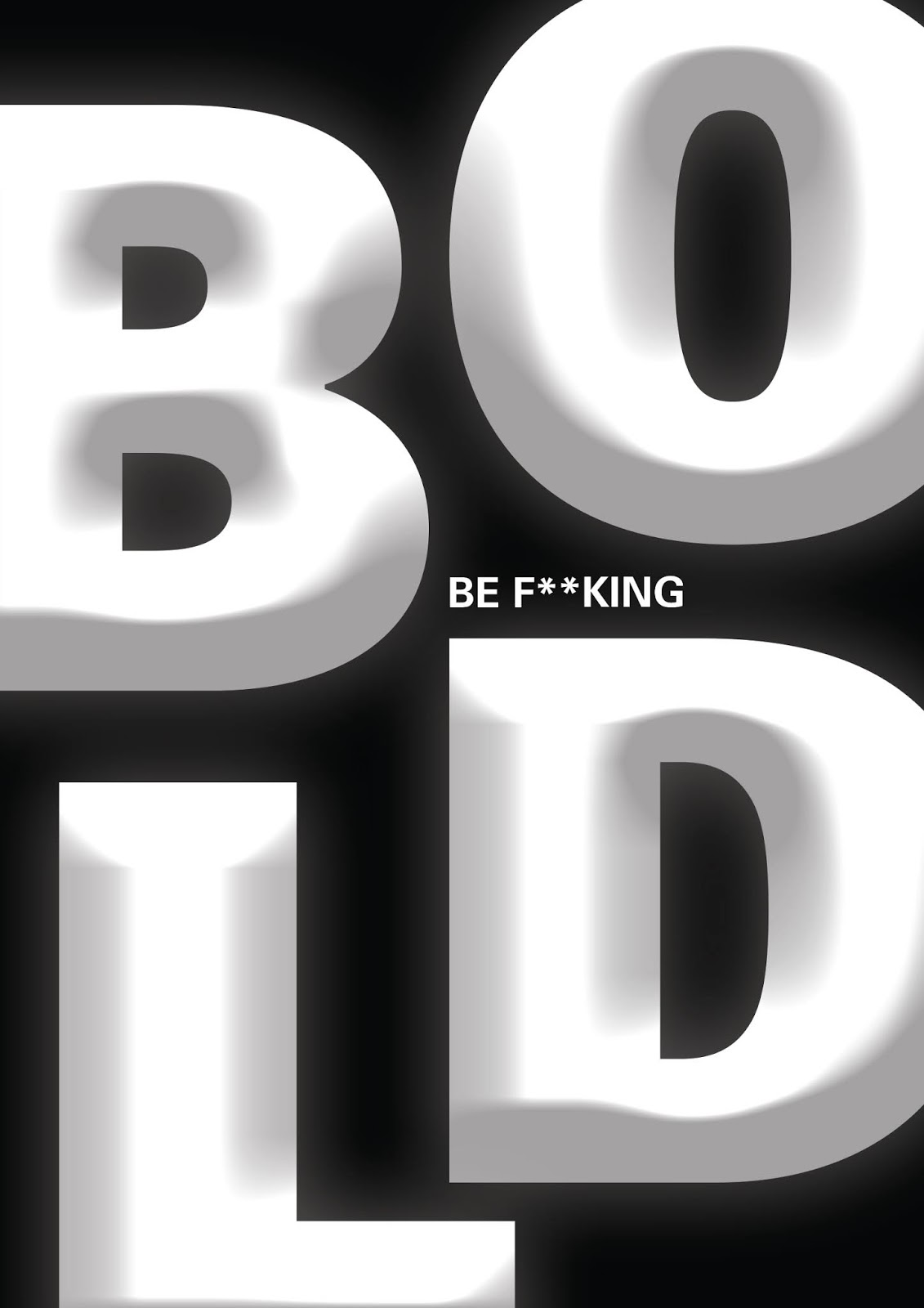
The comments I got from Mr. Vinod were to explore more on the first design. I was told to enlarge "BOLD". With that said, show below is the revised version.
 |
| Figure 1.1: Revised Layout |
Week 11
This week, with the advice that Mr. Vinod gave, I applied the bevel and emboss texture to the word "bold" and tried my hand at animating it. Shown below are the works I've done for this week.
 |
| Figure 1.2: Poster V2. jpg |
 |
| Figure 1.3: Poster V2.gif |
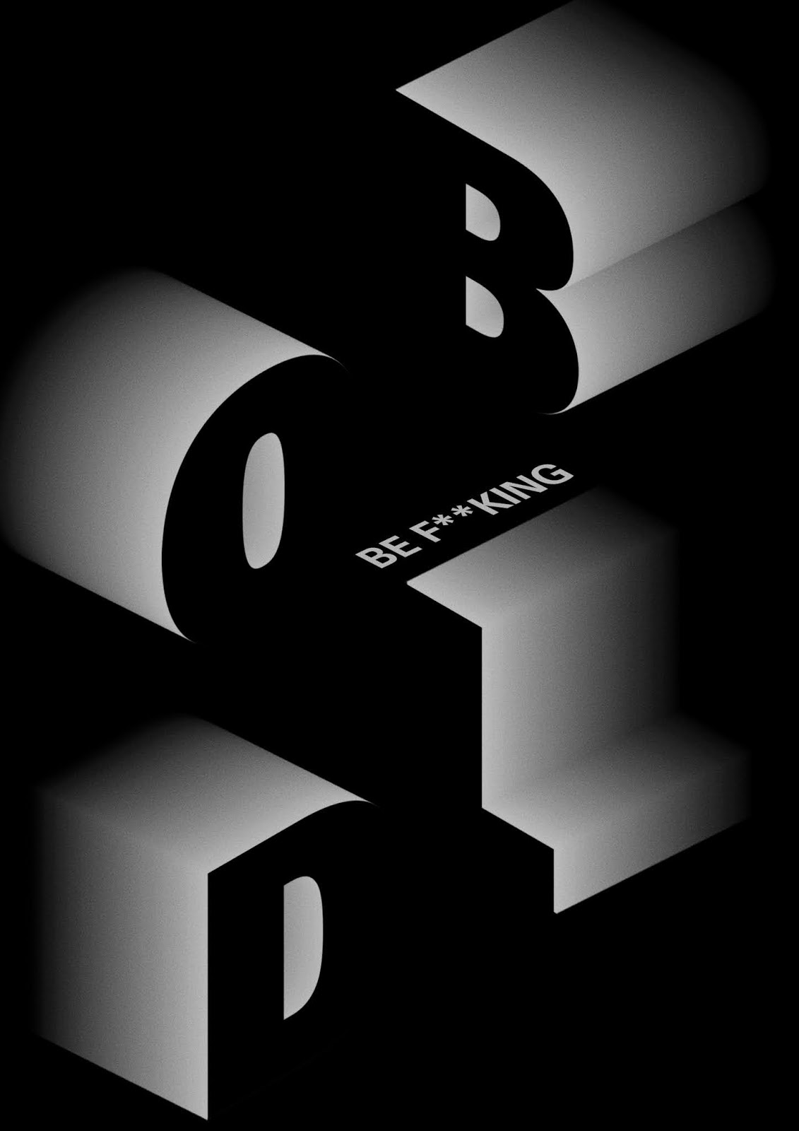
The feedback that I got from Mr. Vinod was to improve on the bevel and emboss effects because it's too basic, which I agree. So, I tried experimenting with 3D effects but my Photoshop kept crashing, which was unfortunate. So, I tried a flat 3D effect instead, but Mr. Vinod insisted that I kept working on it. Nonetheless, I've attached the flat 3D version below.
 |
| Figure 1.4: Poster V2.1.jpg |
WEEK 12
After hours and hours of reworking the poster, I've finally come up with something that I'm satisfied with. Shown below are the revised posters for this week.
 |
| Figure 1.5: Poster V3.jpg |
 |
| Figure 1.6: Poster V3.1.jpg |
The comment that Mr. Vinod gave for was to go with the one in Figure 1.5, and was told to animated the poster. Shown below is the first draft of the animated poster, which I did in Photoshop.
 |
| Figure 1.7: Animated Poster V3. gif |
This week I've shown the animated poster to the lecturers as I haven't got the chance last week. They said it was good to go, so it'll be my final version of this project. The final artworks in gif, jpeg and pdf formats are shown below.
 |
| Figure 1.8: Project 2B_Final.gif |
 |
| Figure 1.9: Project 2B_Final.jpg |
Feedback
Week 10:
Specific Feedback:
- Go with "Be f**king bold" or "Defy conventions"
- The others have no context
- Experiment more with the first layout, enlarge the word "bold"
Week 11:
Specific Feedback:
- Bevel and emboss effect too basic
- Revised design needs more work
Week 12:
Specific Feedback:
- Revised design is better, start animating
Week 13:
Specific Feedback:
- Animation is good to go
Specific Feedback:
- Bevel and emboss effect too basic
- Revised design needs more work
Week 12:
Specific Feedback:
- Revised design is better, start animating
Week 13:
Specific Feedback:
- Animation is good to go
Reflection
Week 10:
Experience:
Coming up with taglines is what I have been doing since the start of my degree, as advertising is my major, so I thought this part of the project wouldn't be too much of a challenge.
Observation:
Coming up with the layout is harder than thinking of the taglines.
Findings:
I've learnt that I need to do more experimenting in my designs, and not play it safe all the time.
Week 11:
Experience:
I had trouble executing with the bevel and emboss effect.
Observation:
I really need to invest in a better laptop, to support my software needs. I got quite frustrated following Youtube tutorials on 3D effects.
Findings:
I need to be more patient in terms of learning something new. Things might seem hard at first but the only way out of a problem is persistence, which I have yet to learn.
Week 12:
Experience:
A little piece of my soul died when I did the third poster design. I had to duplicate so so many layer and edit the gradient layer by layer as parts of my soul died little by little.
Observation:
My tendency of wanting everything to be perfect has taken a toll on me and I broke down due to the huge pressure that I put on myself.
Findings:
I need to learn to calm myself down from time to time and to let go the unrealistic expectations I have of myself.
Week 13:
Experience:
Animating it is not as hard compared to coming up with the initial layout and design of the poster.
Observation:
The animation process is quite enjoyable once you have a clear idea on what you want to do.
Findings:
I'm just happy that I'm done with the project and that the animation had no problems.
Experience:
I had trouble executing with the bevel and emboss effect.
Observation:
I really need to invest in a better laptop, to support my software needs. I got quite frustrated following Youtube tutorials on 3D effects.
Findings:
I need to be more patient in terms of learning something new. Things might seem hard at first but the only way out of a problem is persistence, which I have yet to learn.
Week 12:
Experience:
A little piece of my soul died when I did the third poster design. I had to duplicate so so many layer and edit the gradient layer by layer as parts of my soul died little by little.
Observation:
My tendency of wanting everything to be perfect has taken a toll on me and I broke down due to the huge pressure that I put on myself.
Findings:
I need to learn to calm myself down from time to time and to let go the unrealistic expectations I have of myself.
Week 13:
Experience:
Animating it is not as hard compared to coming up with the initial layout and design of the poster.
Observation:
The animation process is quite enjoyable once you have a clear idea on what you want to do.
Findings:
I'm just happy that I'm done with the project and that the animation had no problems.
Further Reading
Week 10 - The Graphic Design Idea Book (Steven Heller & Gail Anderson)
The book is an introduction to the key elements of good design, which could be of use in this project. It is broken into sections covering the fundamental elements of design, key works by acclaimed designers serve to illustrate technical points and encourage its audience to try out new ideas. The content is an instantly accessible and easy to understand guide to graphic design using professional techniques.
Week 10 - The Graphic Design Idea Book (Steven Heller & Gail Anderson)
 |
| Source: Lawrence King Publishing |
The book is an introduction to the key elements of good design, which could be of use in this project. It is broken into sections covering the fundamental elements of design, key works by acclaimed designers serve to illustrate technical points and encourage its audience to try out new ideas. The content is an instantly accessible and easy to understand guide to graphic design using professional techniques.


Comments
Post a Comment